Mark your calendars, folks, and begin the countdown! We’re just over three weeks away from the opening of FIFA World Cup 2026, where some of the best athletes in the world will come together to represent their countries in nation-versus-nation matchups. While most Americans refer to this sport as soccer, the rest of the world refers to it as football, and I do think they’re onto something. After all, the “f” in “football” stands for nothing if not for “fashion.”
For many nations, the World Cup gives the chance to showcase their classic looks, stalwart against time, on the world stage. The blue and white stripes of Argentina return as reigning victors from 2022, the Oranje of the Netherlands will again tower against the goalposts, and the radiant yellow kits of Brazil shall dance their ways across the pitch once more. So where does the USA rank amongst these iconic designs? Let’s take a look at twelve standout kit sets over the years and how they ultimately hold up under the world lens.
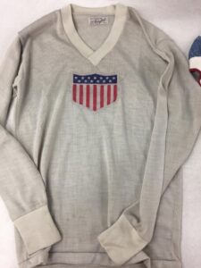
1930 World Cup
Where else to start but the beginning? The first World Cup inevitably set the precedent for all kits going forward. White took center stage as the primary color with a vintage center placement of the team badge. This kit broadcasts a look that is clean, elegant, and bespeaking of a simpler time. Although, a modern washing machine to get the mud out of those shirts would surely have been welcome.
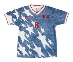
1994 Away
1994 saw the debut of the legendary “denim” kit, an all-time great. It was met with mixed reception at its release, but what great works of art were truly appreciated in their time? The textured design has since gone the way of the Jazz plastic cup and now resides in the territory of undeniably, nostalgically iconic. This jersey is unique and distinctive, but does not compromise its boldness or strength as it borrows from the American flag. We may never see its like again.
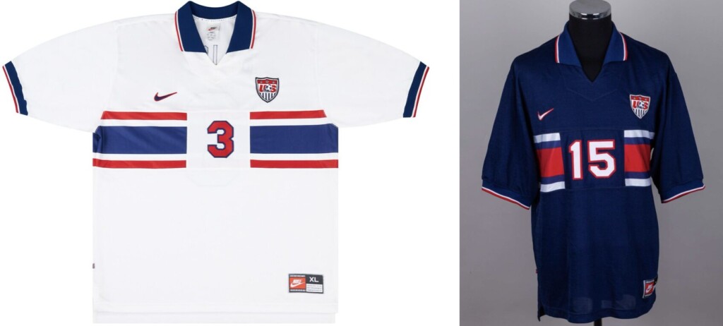
1995 Home & Away
A complimentary duo, the 1995s might not stand out in a crowd but were a solid deliverable. Like their 1994 predecessors, they are easy to pin as definitively 90s—but this time, the design brought increased versatility at the cost of character. Collars and horizontal striping invoke some slight rugby familiarity, fitting for a team known for their physicality, scrappiness, and grit.
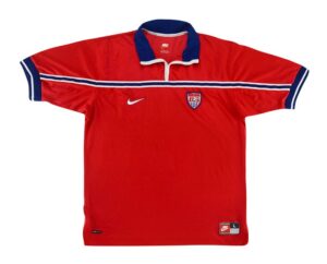
1998 Away
Sometimes a kit’s strength comes from its inherent design, and sometimes it comes from how it represents who’s wearing it. The 1998 Away kit, regrettably, has neither strength. This US kit is giving…Denmark? And beyond that mismatch, the jersey is part of a small but notable sample size that demonstrates the limited appeal of US jerseys that use red as their base color. It borders on gaudy, with the frailness of the thin striping failing to break up a design that is ultimately a bit of an eyesore. It could maybe make a nice polo, but as a soccer kit? Big miss.
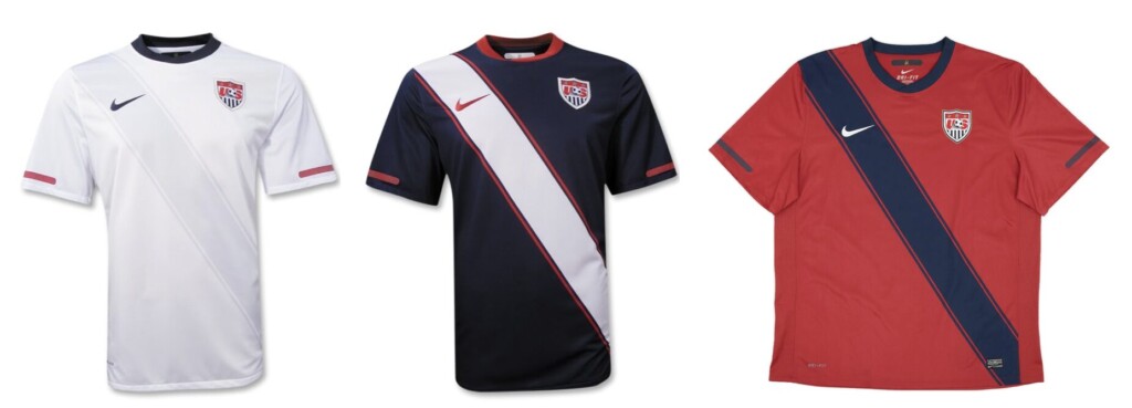
2010 Home, Away & Alternate
The era of the sash for club and country alike, fans received a coordinated rollout in favor of that design in 2010. The Home kit stands out as the leader of the pack, the shine of the subtle diagonal stripe successfully breaking up what risked being a bland kit and moving it closer to “classy” status. The Away kit also brings value to the table, pulling together a complimentary color scheme to round out a smooth, brandable palette–however, the distinctiveness of the sash leaves it in more divisive territory depending on an individual’s fondness for that style of design. And not to be forgotten, the Alternate kit fails in its returning attempt to make a red base work. Rich crimson butts against deep navy borrowed from its Away sibling, resulting in a muddy, lifeless final addition to the 2010 set.
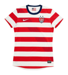
2012 Home
Friends, it’s time to meet another all-time great: the 2012 Home kit, affectionately known as “The Waldo.” This kit is so good that a significant number of fans have pleaded for it to become the USA’s definitive Home design ever since. A subtle sashing tells you that yes, we are in the early 2010s, but the sharpness of how the American flag’s red and white stripes transfer into a hoop pattern is all that folks really care about. Paired with navy shorts, this kit is distinctly American and no other kit in the world has ever looked quite like it, leaving its design just begging to be snapped up to join the ranks of iconic, timeless jerseys. Some may say it’s best to stay away from horizontal stripes in your day-to-day attire, but on this kit they serve a design that is ready to proclaim its identity in an instantly recognizable glance.
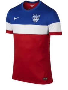
2014 Away
2014’s Away kit, a.k.a. “The Bomb Pop,” firmly fits in you-love-it-or-you-hate-it territory. It certainly gets points for distinctiveness and its attempt to give all three US primary colors a chance to play on one jersey, but does it truly work? Points might get taken off for the shades of those colors used. Depending on the light catching it, its electric red starts to drift closer to orange tones, and some might find it a little much when paired with its reflective blue shoulders. It’s certainly allowable to consider this jersey iconic to a certain degree, but many would find it difficult to concede that it actually looks good.
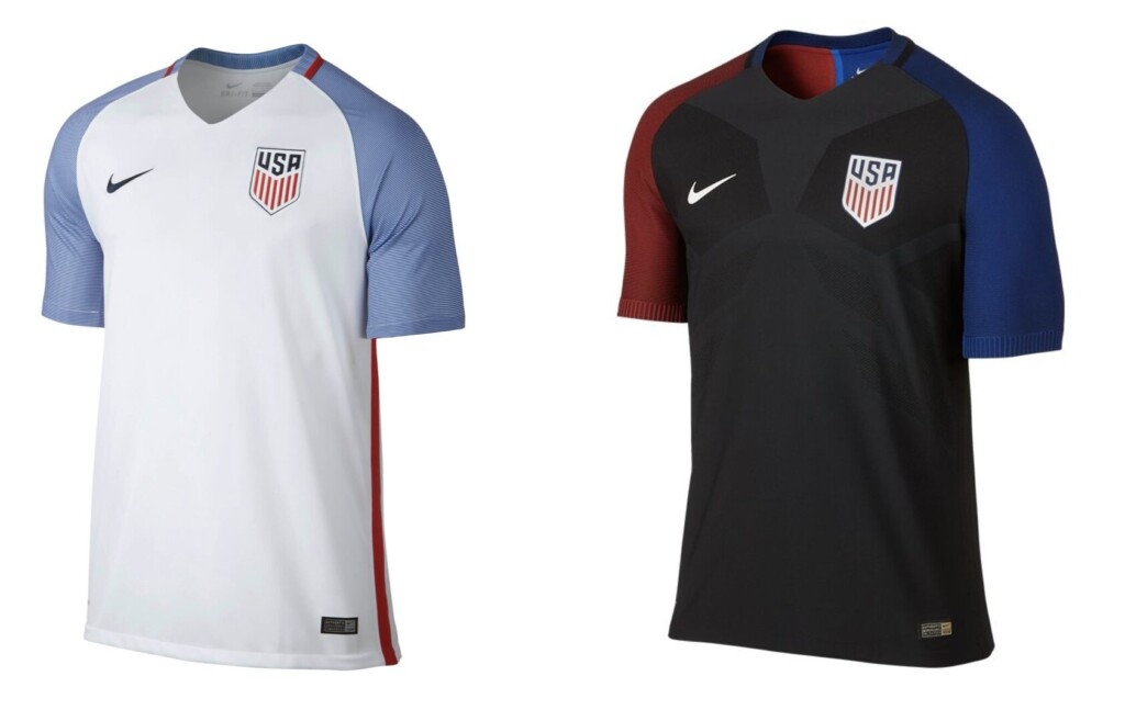
2016 Home & Away
It was the best of times, it was…wait, no, it was actually just the worst of times. The lackluster 2016 kits ushered in some of the darkest days in U.S. soccer history, when an aging generation struggling to transition to their successors failed to qualify for the 2018 World Cup. Beyond this institutional low, that team had to wear jerseys that would have been more befitting of a training kit. This team was blown away like chaff in the wind of a sky matching the pale blue sleeves of their Home jersey, a color weakly paired with a boring, unbroken solid white base. The Away kit? An equally boring black base. And most egregiously, when have mismatched sleeves ever worked for anyone? A forgettable kit selection for an era that U.S. soccer wishes they could forget, too.
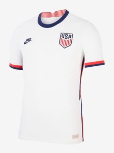
2020 Home
For another nation, the 2020 US home kit would be nothing special. For the US, however, this kit brought a breath of fresh air that was so deeply needed after some recent design misses and a team that was starting to solidify its new identity. The solid white base paired with distinct navy and red highlights brings a strength back to the classic US home palette, its clean look approaching the “timeless” category. What might keep it from crossing the border, though, is the nature of those highlights. The zig-zagged stripes down the sides of the kit do bring some life to an otherwise simple design, but is a pattern that is quickly being recognized as a product of its time. This kit was a good burst of energy, albeit one that was slightly unsustainable. Thank you for your service, 2020 Home kit.
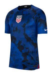
2022 Away
Ah, the era of “amorphous blue blobs” for American soccer. The US unfortunately saw several of these kits in the early 2020s, but the real crime that sets 2022’s Away kit apart is that the team had to wear it for their first appearance on the world stage in eight years after their failed 2018 qualification. Splotchy, patchy, formless? I’m sensing another metaphor here for a national program that continues to be criticized for its modern lack of identity. Is just a bit of structure too much to ask for? This team brought a lot of anxiety to their fans over this era, and this kit certainly didn’t help.
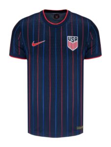
2025 Away
If you ask a romantic to label “America’s sport,” they’ll likely tell you it’s baseball. Pinstripes are more common there than in the soccer world, but oh, does this kit pull them off! Conduits of neon inject life and energy into the 2025 away kit, without being dangerously predominant enough to age it swiftly and poorly. This jersey serves as a lovely homage to the wider world of sports culture in America, while still feeling aerodynamic and distinctly a design that says, “soccer.” Take me out to the ball game? Sure, but this ball is driven forward by cleated feet instead of wooden bats.
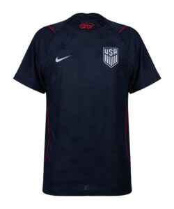
2026 Away
Looking to share in the success of past flag-homage designs, 2026’s Away kit unfortunately captures none of the same iconic flair. Aiming for tastefully subtle stars on a deep navy base, the rigid and awkward pattern spacing ultimately result in a bland, uninspired kit with none of the pomp and celebration that a host nation should carry into a World Cup. The timing of the jersey’s unveiling also didn’t help its cause, with its “stealth ops,” borderline-militant vibe feeling increasingly tone deaf as it accompanied the opening weeks of the United States’s war with Iran.
***
So, what US soccer kit designs stood out to you? And certainly, this list only scratches the surface of so many kits that pain me to leave off of it. But yet, the strength of a team does not simply lie in their kit. It lies in their drive, spirit, and readiness to show the world that they are ready to fight for each pass, header, and shot on that field. Will 2026 hold a disappointing tournament exit for the US Men’s National Team, or do they have what it takes to summit unprecedented heights while representing the stars and stripes? Let’s find out together—see you in June!

Luke Brandsen graduated in 2019 and uses his business/HR degree to inform directing mission-focused programs. He currently lives in Ann Arbor, Michigan, where he squints at the players on his bootleg soccer stream, breaks guitar strings, and desperately tries to recall where the last D&D session he ran left off.