
Every day, I see a new headline that makes me want to cry. The tightness in my chest grows, and my sandpaper bed awaits me in the evening. I had a panic attack in my bed the other night—I was thinking about my crushing debt, rising rent, and all other unforeseen and foreseen horrors. Compared to others, my problems feel trivial. Everyone is in debt. I have a steady job, I am not being actively deported or bombed, nor am I being pursued by anyone trying to take my freedom to love, yet.
This is, in fact, a love letter, I promise.
What calmed me down the next morning wasn’t pouring myself into work, music, and so on. It wasn’t chatting with friends, or meditation. It was looking at hi-res scans of sheets of dry-transfer type.
Weirdo alert.
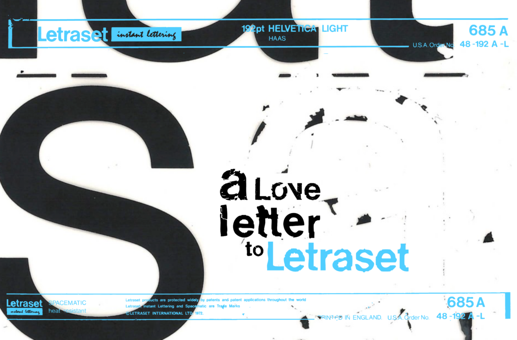
Letraset is what graphic designers, marketers, and advertisers used to use to lay out type, imagery, and graphics in ads. It gained significant popularity from the 60s to the 80s because it provided a quick and affordable way for designers to create text and images without needing traditional typesetting or hand lettering. It was a tedious and arduous process. You would have to lay a sheet of it down where you wanted it and line up the letters perfectly, step by step. Spacing and kerning the letters perfectly with your hands, but the sheets were somewhat unpredictable to work with. As the sheets age, it becomes more and more common for a letter to jump a line or hop out of place, which would ruin the ad someone might have worked hours to produce. I’ve heard so many designers bitch, complain, and curse the Letraset name. The dry-transfer type is now a relic of the past. Now, due to technological advances, typesetting is so easy that toddlers can do it.
Before Letraset, it was woodcut type, then lead type, and before that, it was hieroglyphics, calligraphy, and so on. Design is inherently iterative.
There’s no functional need for any of these techniques anymore. However, when I look at Letraset and compositions created using the aging pages, I swear I see the letters breathe. They hop, skip, jump, break, fracture, crack, and decay. They feel like a scream fading into a breath.
God, I sound annoying. It has to be the lack of sleep.
But I felt my heart swell for the first time in months—looking at a scan of a page of type that’s probably older than me. This is a page I’ve touched, used, and now reused through having a scan. Letraset got infinitely more interesting once it got outmoded. These outdated tools hum with life. There’s a fidelity and character that you don’t get using a computer. It’s almost impossible to replicate digitally.
Seeing humanity in letters in my job. I get to do this for work.
In high school, being on the yearbook staff ignited in me an interest in graphic design. But woodtype and letraset were catalysts for passion. They weren’t just tools—they were teachers. They taught me that type has a heartbeat.
I can safely say that I love Letraset with my whole heart. When I look at the page, I can see memories. I see scars. I see more personality than most have in their left thumb. I see something fragile—but I know this page is older than I am, and if taken care of properly, might outlive me.

When you look at a page of Letraset and particularly this Helvetica page, you’re seeing the remnants of a system within a system. Helvetica is a typeface designed for standardization and perfection. Both Letraset and Helvetica are systems someone set up, manufactured, and distributed. But this page is decaying and blowing up what Helvetica was designed for, just by aging and being used. Nothing about this page is standard or the same. Every letter will leave the sheet a little different. It’s both beautiful and hilarious.
People now mostly use dry transfer to create abstract compositions and explore the possibilities of type and its capabilities. These—when done well—make my heart swell just as much.
I’ll never stop using my hand skills as a graphic designer. Type, whether it be hand-drawn, woodcut, dry-transfer, grounds me. It reminds me I’m still here.

Izzy Nunez graduated from Calvin in 2022 after studying graphic design and sociology. Today she lives in North Carolina where she is living out her dream of being a graphic designer.

Weirdo alert? No! Letraset thoughts were meant to be shared!
Izzy this was great!! Bravo!
This is how you do it…